How we’ve created a brand that truly reflects who we are
Do you know that gut feeling that appears when you’re sure you’ve done something right?
That’s kind of how we felt back in 2014.
It was the year of the Winter Olympics in Sochi, ALS Bucket Challenge, and Pharell’s Happy. But for us, it was the year we created Mediatoolkit, our online media monitoring software.
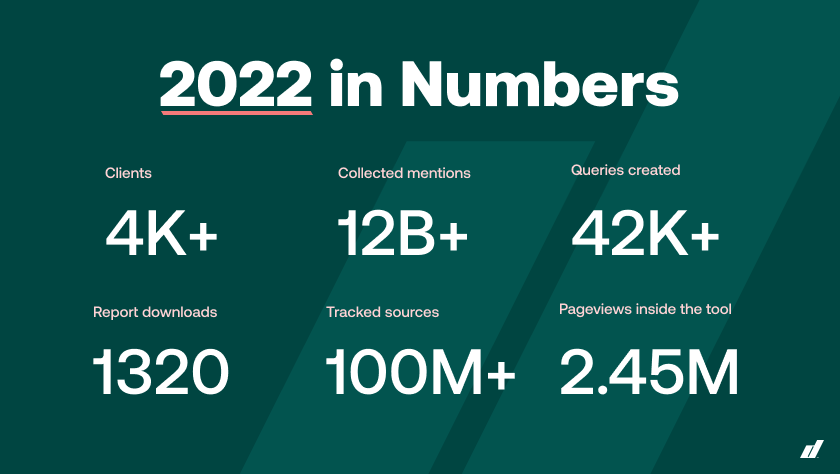
Like every company that’s just starting, we started small. Simple tool functionalities, a clean dashboard, and a strong determination to do more. Throughout the years, we kept building the tool, adding features, and working hard to help our clients make sense of all the information they get. And with time, the company has evolved. This has opened up additional opportunities to develop the tool and position it on the market. We’ve grown to a company of 50 employees, tracking more than 1 billion mentions monthly from over 100 million online sources and delivering them to our 600+ customers.
Since the start, Mediatoolkit has had one clear vision – to help people around the world find and understand relevant information on time to reach better business decisions. This vision has evolved from our strong company culture that keeps permeating everything we do. A company culture based on quality, progress, transparency, ownership, and a strong sense of community.
One thing has remained the same throughout all this time, though – our brand image and brand identity. And at a certain point, we started noticing a discrepancy between our in and out, between what we’ve achieved and how we appear. We felt that we’d started making serious progress but maybe weren’t taken too seriously. And we started talking about change.
“We tested going into the mid-market, we tested the new prices, we pushed the product further, and rebranding was the only missing piece of the puzzle.” Igor, Head of Marketing
But… we liked the old us.
The process of rebranding, especially when you’re changing both the name and the entire visual identity, always starts with the fundamentals – the who’s, the what’s, and the whys. So we went back and started redefining the core of our identity.
At first, it was just us talking about why we do what we do and what higher purpose it has. And it always came down to one thought:
We make sense of the world around us.
But what kind of a bunch do we strike as? Who do we wish to be? What do we believe in? Could we make the world a better place? And if yes – how?
And that was great. But also very difficult since the old name and brand identity were something that grew on us and that we’ve lived for for so many years. We knew that something had to change, but we just weren’t sure how to do it. And as much as this rebranding was a business decision, for us it was very personal, too. So we needed someone else to hold up the mirror and point to the obvious. And we found just the agency to do it perfectly.
Soon, things started falling into place.
Let’s meet…and then let’s meet again.
At first, it looked like we were moving very slowly. We kept meeting and just talking to each other about everything – our history, employees, culture, industry, wants, and needs.
This, however, turned out to be the most important part of the whole process, which was carefully divided into stages.
Our partner agency really needed to get to know us inside out to be able to create a new brand image that would fit who we are perfectly. But we didn’t count on running late already in this first phase.
And this was one of the first things we’ve learned – no matter how well you’ve planned the whole process, it will probably take double the time.
“We’ve been growing steadily in our market for the last eight years. We’ve created a whole solution for mid-market companies and now we want our brand to stand behind that and show the world what we’ve already been doing.” Ivor, Chief Operating Officer
The next chapter for Determ and our customers
Determ is a straightforward and diverse brand, freshened up with new colors and a new logo, representing our commitment to helping our customers find and understand relevant information from the media to drive better business decisions.
Our new motto, “Make sense”, captures our focus on providing reliable and meaningful data for decision-making. With the ever-growing surge in online channels and social media usage, our customers’ need to monitor their online presence is becoming more present.
Every minute on the Internet, three million Facebook posts appear, more than 500 hours of YouTube videos are uploaded, 100.000 new blogs are written, and almost half a million tweets are published on Twitter. Without Determ, it would take you two and a half months to read through that content, leaving you and your brand in the dark.
“Our rebranding is definitely not just aesthetic. We’ve done this as a strategic decision to move towards where our product and customers already are. So we wanted our brand image to reflect that constantly to our customers and our employees.” Ivor Bihar, Chief Operating Officer
This change brought several essential improvements for our customers:
- Our visual identity was freshened up with new colors, making our UX less busy and improving the overall customer experience
- All of our communication channels are aligned under a common brand identity, ensuring consistency across all touchpoints.
- In the same spirit, our product was adapted to the changes and has a clearer interface enabling you to find important information even faster.
The new brand will enable us to build a stronger bond with our customers and continue supporting them in making sense of the world around them by delivering relevant information from the media in real-time.

Building Determ
Naming: determine, term, determined – DETERM
Choosing the name and the entire logistics around it took almost three whole months.
Why did we decide to change the name in the first place?
Well, though we find it hard to admit, our old name was a mouthful. It was long and difficult to remember. How can you even stand out from your competitors when your own clients can’t remember how your name is spelled?

In numbers, we had:
- 3 rounds of new brand name proposals
- 20 names in each round
- And a whole set of issues and challenges we didn’t count on from the start.
There were several criteria we needed to meet:
- We wanted a .com domain
- Simple name with an available trademark
- Different from what’s present on the market
- No cultural connotations in any of the world languages
And though these criteria seemed rough to meet, they made the whole choice slightly easier – suddenly, a lot of proposals didn’t fit. And we were left with 10 names that went through a democratic vote until we finally came to the one which won – Determ.
“Our new name is deeply rooted in who we are and what we do. “
Klara, Designer
We find relevant terms.
We determine which terms are important.
We make companies more determined in decision-making.
We are Determ.
Once we found the right name, our partner agency helped us breathe life into it.
Look and feel – brand colors and personality
The smartest kid in class
One of the most important elements of your brand identity is its tone of voice. Defining the tone will point your brand in the direction you want to go, and toward the customers you want to reach.
A couple of months into our rebranding, we did extensive research on our target audience and figured out who we wanted to talk to. With that, half of the work was almost done. So all we had to do was to find the language that would talk to our audience in the best way.
Again, it was time to go back to what we do.
Our solution serves as a source of guidance. It informs our users, gives valuable information, and, finally, helps their businesses progress. It provides knowledge. So it serves as a kind of mentor or teacher in your everyday business life. And this precisely is how we envisioned it – as somewhat of a classroom geek. Smart, decisive, straightforward, systematic, and analytical, but also fun and outgoing. The kind of kid you’d ask for help if you didn’t understand something in class and the kind of kid that would be more than happy to do it.
Color me pink/green
When asked about our old brand identity, Klara, our Designer, probably said what all of us were thinking this whole time:
“If I had to describe our old brand identity with one expression, I’d probably say – lack of consistency. We had one thing on our landing pages, a second thing on social media and in newsletters, and something completely different on our website. Sounds like every designer’s nightmare, right?”
Just to add – we had 2 versions of our logo and 3 different fonts (on the website, in visuals, and in newsletters). You can probably imagine how difficult it was to create a unified brand look with so many different versions of everything.
Why is this even important? Our Klara explains it brilliantly:
“If you aren’t consistent throughout every part of your customer journey and on every channel, it’s hard to achieve recognition within your target audience.”
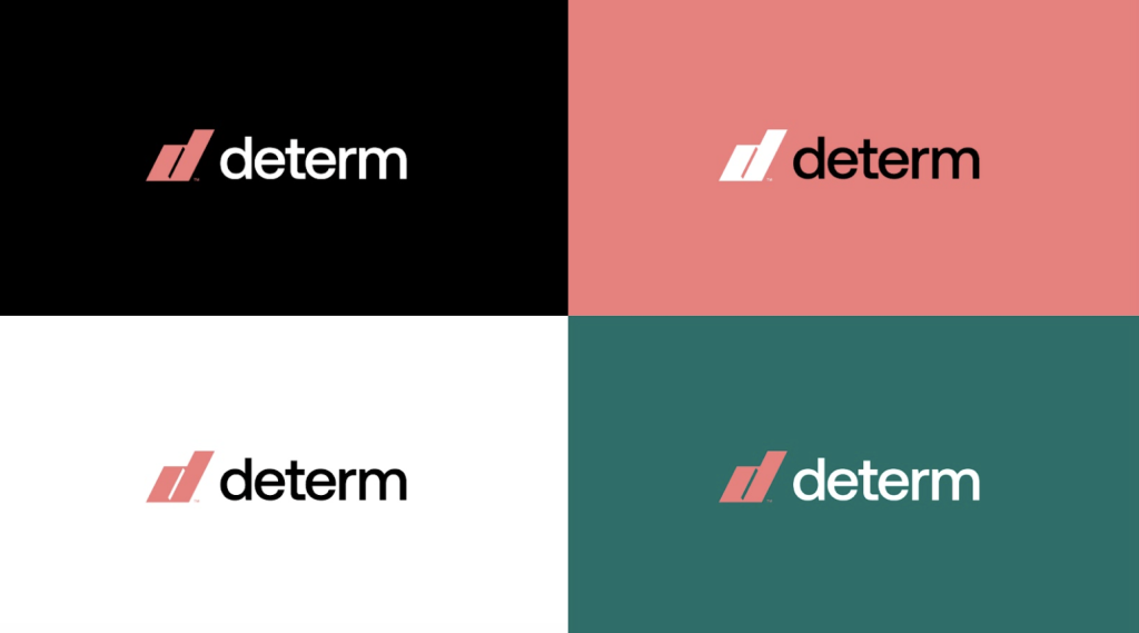
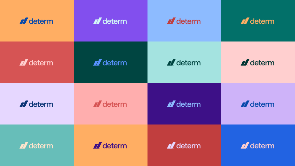
Determ signifies a new era in our look. We have 2 primary colors – peach pink and green, and a whole set of secondary colors to play with.
There isn’t a deep philosophical meaning behind these colors. But what this visual identity does represent is the middle ground between serious and playful. Just about right to show off our new bold personality.
Logo + Typeface
The new look called for a new typeform and the new Aeonik, published in the summer of 2022, looked like a perfect fit right away. Coming from the sans-serif family, Aeonik looks very fresh, clean, and straightforward.
Our rebranding is definitely not just aesthetic. We’ve done this as a strategic decision to move towards where our product and customers already are. So we wanted our brand image to reflect that constantly, to our customers and our employees. Ivor, Chief Operating Officer
And the logo?
Well, the whole process of choosing the logo wasn’t nearly as long and challenging as choosing the name. And since we really love the new font, we almost chose to have the whole name as our new logo. But then we got a couple of solutions, and we loved one of them right away.
It’s a more technical logo pulled from visual elements from our tool. It’s comprised of two lines that seem like a styled letter D. Lines are, in fact, one of the key elements of our visual identity. They represent the core of our business – highlighting what’s important – and they are also present in our website design.
See how the whole story makes sense?
And yes, Make sense is our new motto.
What’s next?
In today’s information overload, it’s hard to determine what’s important and what isn’t. We at Determ have accepted it as a challenge.
A challenge, that made us build a global media monitoring and analytics solution with unparalleled coverage. That encouraged us to make it easy to use for everyone. And that ultimately drove our change.
This whole process has raised a lot of questions, enticed a lot of conversations, and, ultimately, further strengthened our values.
We knew we had them right the first time around.
We just needed a different way to present them to the world. And we believe we found it.
Hope you’ll like it as much as we do.
“Being able to take the company values that we have, and translate them into the brand that Determ is, is one of the greatest successes that we’ve had.”
Igor, Head of Marketing
“My favorite feature of the whole rebrand is actually the purpose statement that got distilled from the whole process. And it’s to make sense of the world around you. And this is actually what we do here at Determ.”
Ivor, Chief Operating officer
